Components
An entity is nothing but a receptacle for components.
The components give it all its actual data, even its UUID and displayed name, see euid and debug_name components.
The Components extension allows you to attach, detach and modify components.
This extension uses the SDK to determine which entity or entities are selected and displays the components accordingly.
Basics
If no entity is selected it will show this:

When an entity is selected the extension becomes active and displays the selected entity information.
To be able to edit components you must have write access to the scene.
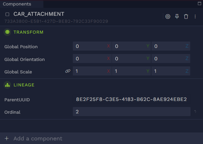
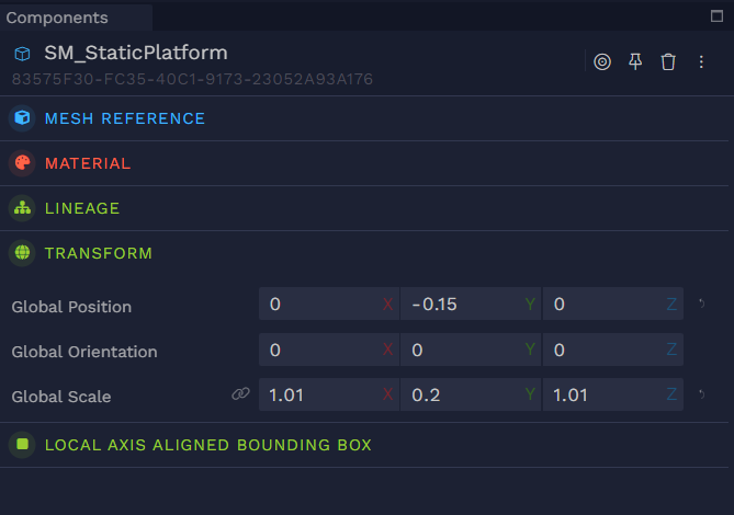
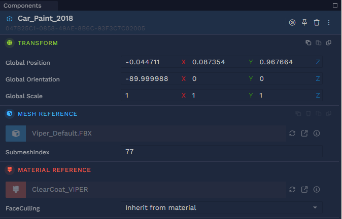
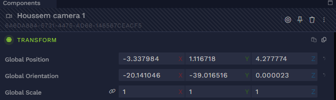
The panel is divided in three areas, the top header, the components accordion and the Add a component menu.
On the top header you’ll find information about the entity and a toolbar.
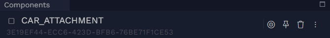
You can edit the entity’s name by clicking on it. Under the name you’ll find the entity’s UUID and hovering over it will reveal a button to easily copy it.
The name and the UUID are actually components in disguise, respectively the debug_name component and the euid component.
Remember, an entity is a mere container for components, and doesn’t hold any data by itself.
The target button allows you to focus that entity in the canvas.
The pin button allows you to lock the panel to the current entity selection, i.e. selecting another entity won’t display its components, but rather keep displaying the locked entity’s components.
The trash button deletes the entity (and all its descendants).
The three stacked dots opens a contextual menu.
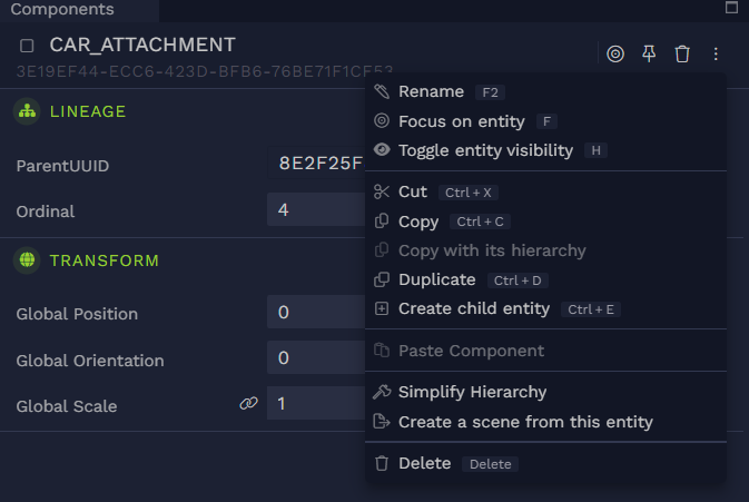
This is the exact same menu that shows up when right clicking on an entity in the Scene Graph extension.
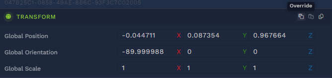
Hovering over a component zone reveals a toolbar containing several buttons on the right, one is for deleting the component, another one for pasting a previously copied component — it will be grayed out if the clipboard doesn’t contain a component, and yet another for copying the component.
Note that this toolbar is contextual, some components are not removable like the local_transform or lineage. Components that reference a graph, like material, will display a shortcut button to open the appropriate graph editor.
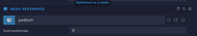
Hovering over a component’s name or any of its attributes displays a tooltip with a description of that component or attribute.
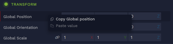
Right clicking on a component’s attribute reveals another contextual menu that allows you to copy or paste a specific attribute value.
Clicking on a component will collapse the component details. Clicking on a collapsed component will unfold it.
The bottom bar allows you to add a component to the selected entity.

Clicking anywhere on the bar reveals the component list.
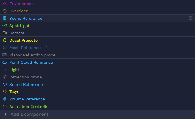
Any component that is already attached to the entity will be grayed out and a check mark will appear on the right.
Hovering over a component will reveal an information button on the far right of the entry, clicking on it will display a brief description of the component.
Typing in the bar will filter the component list.
Multi-selection
Selecting multiple entities will show only the components that are common to all selected entities.
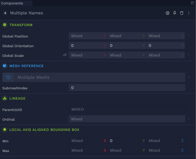
Attributes that have the same values for all entities will display that value.
If values differ they will be replaced by Mixed.
All values are editable and will apply to all selected entities.
External entities
Entities that are brought via a linker, i.e. an entity with a scene_ref component, are called external. The component panel for external entities has a lighter blue background. External entities are read-only thus the components are not editable
Overriders
Hovering over an external entity will also reveal a toolbar on the right side of the component header.
This toolbar has an extra button compared to a regular local entity: the Override button.
Overriding a component will change its background to a darker one as if it were a local entity.
The term OVERRIDDEN will also appear next to the component’s name.
Overriding a component makes it editable.
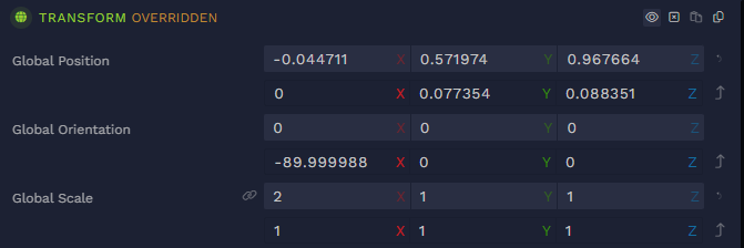
Additionally, a new option appears in the component toolbar: See original values.
Clicking it will display the values of the original entity.
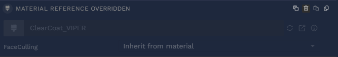
The Discard override button will reset the component back to its original values and turn it back to read-only.
The delete component option becomes Mark component as deleted.
Clicking it will gray out the component, but not actually remove it from the view.
A new option appears Restore component which will bring back the component with its original values.
Adding a new component to an external entity is done by overriding it as well.
The bottom bar now shows this: Override with a component. The behavior is the same as for local entities.

Transient entities
Transient entities will display their header with a hatched background. They act as local entities except that any change in their components will not be persisted.
Modifying a transient entity will not affect the Undo/Redo stack, i.e. you cannot undo any changes to an external entity. Clicking undo will revert the last persisted action.
Collaboration
When multiple users are editing the same entity, their avatar will appear in the header section.
Note that you only see other users' avatars, your own avatar won’t appear.
